This project is part of the Prime Household initiative, calling out the current onboarding experience for Household.
It needed a refresh to reflect the current Prime brand as well as exploration to find pain points and raise adoption rates.
I led the end-to-end UX for an onboarding CX for Prime Household.
↓ Check out the nerdy details below ↓
Sr. UX Designer
April 2023
User Research, UX Design, Prototyping, Testing, Storytelling
Sr. Product manager, Sr. Software engineer, UX writer
Prime Worldwide's leadership intiative to improve the entire Household experience had us focus on the experience in place for Prime members who were inviting an adult to share their Prime account.
There had been a few product-led experiments beforehand, but metrics hadn’t improved. The customer feedback mentioned that the current experience was confusing.
Prime members are allowed to share their account with another adult as part of their Prime membership. The metrics showed that only 10% of members used this benefit and drop-off rates were high. In order to improve the experience we needed research that could inform us where the main pain points where in the customer experience.
Role & Challenge:
As the Senior UX designer on the project I worked closely with a Senior PM, Senior engineer, UX writer, legal, and the design systems team. It was important to understand the main pain points, gain alignment with stakeholders, keep flows simple and clear, and test to validate solutions and assumptions
Business goals:
To redesign the experience to reduce confusion, increase completion and adoption rates, reduce customer service calls and improve overall satisfaction.
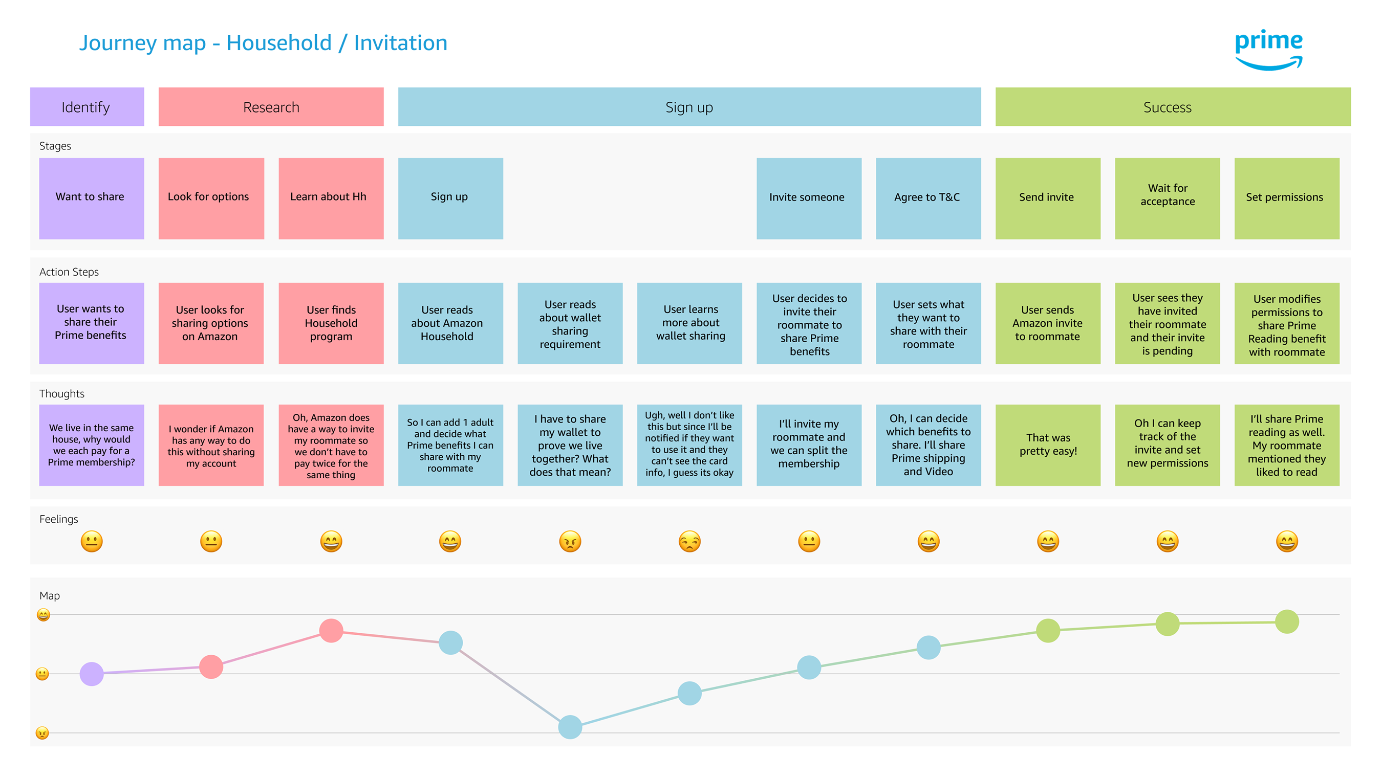
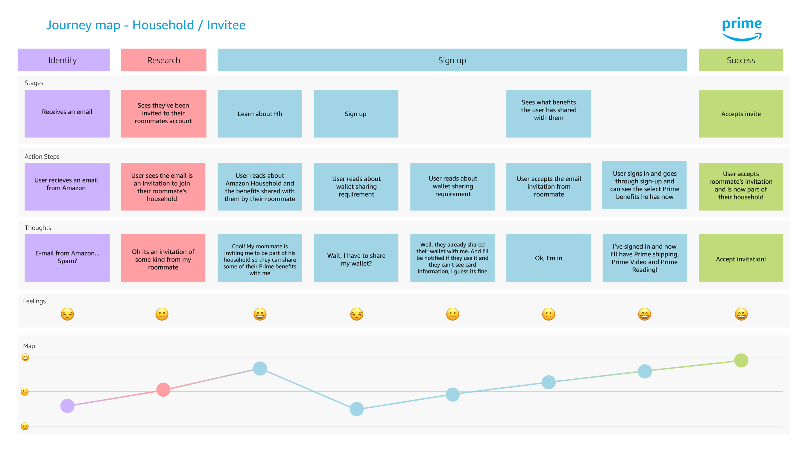
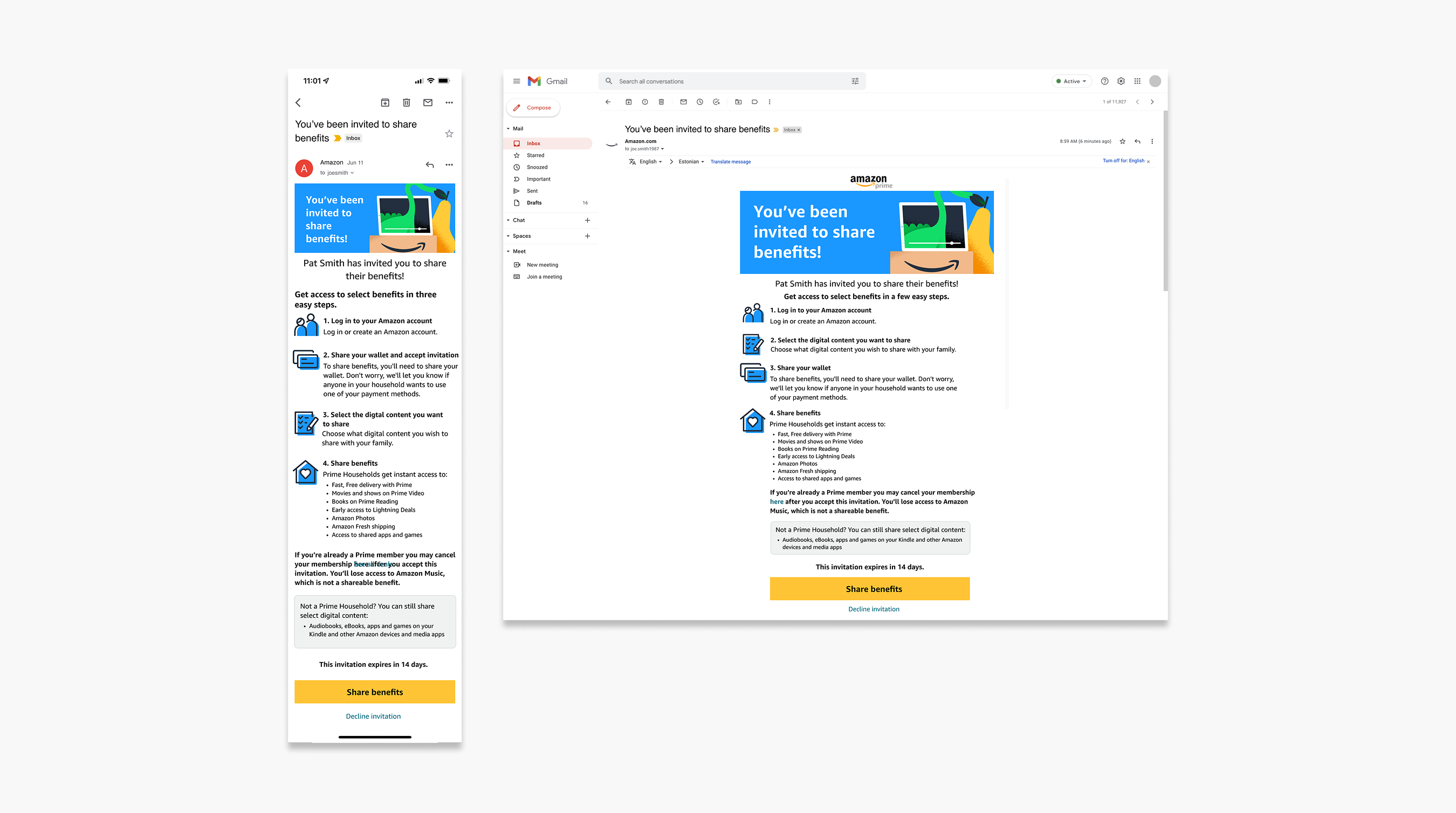
Original flow to invite an adult to your Household
Research & Insights:
The first step in my design process was to do a usability test to get a baseline reading of the experience. I wanted to understand exactly how users were interacting with the existing experience.
Customers mentioned a lack of clarity throughout the process that made them abandon the flow all together. Particularly when asked to share wallets, which with many unanswered questions made it too high a risk for them. Unhappy paths had complicated solutioning and prompted customers to reach out to customer support.
After a quick run through the existing experience these were some of the results:
1 of 14 read/skimmed the Household homepage
12 of 14 felt confused while going through the flow
12 of 14 felt it wasn’t worth it
12 of 14 felt confused about sharing their wallet
9 of 14 said they would prefer to log in and share their account directly
1 of 14 said they would complete the flow and sign up
Some of what I heard during these sessions was:
“I don’t understand! I already pay for this membership… why do I need to share my wallet to use this benefit?!”
“What if I want to share my account with my mom or a roommate? I don’t want anyone with access to my credit card information.”
To gain alignment with cross-functional partners, I mapped journeys for both the inviter and the invitee. This made the friction point obvious: it appeared in the same spot for both parties.
This helped my partners and stakeholders understand where users were getting stuck and why a different approach was necessary.
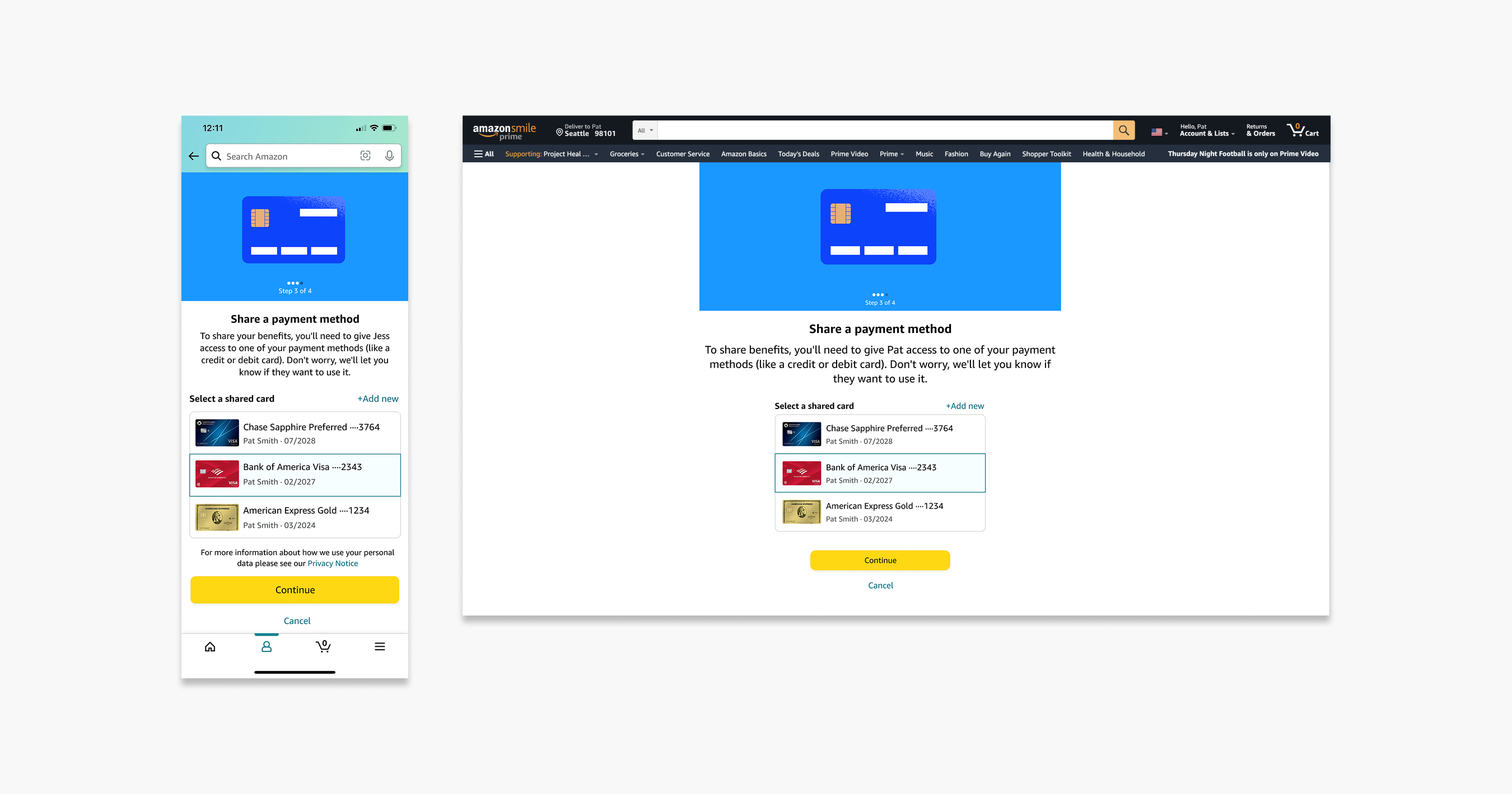
Design strategy:
As I redesigned the flow. My focus was on clarity and setting expectations, if users knew what to expect, the experience would feel simpler and less intimidating.
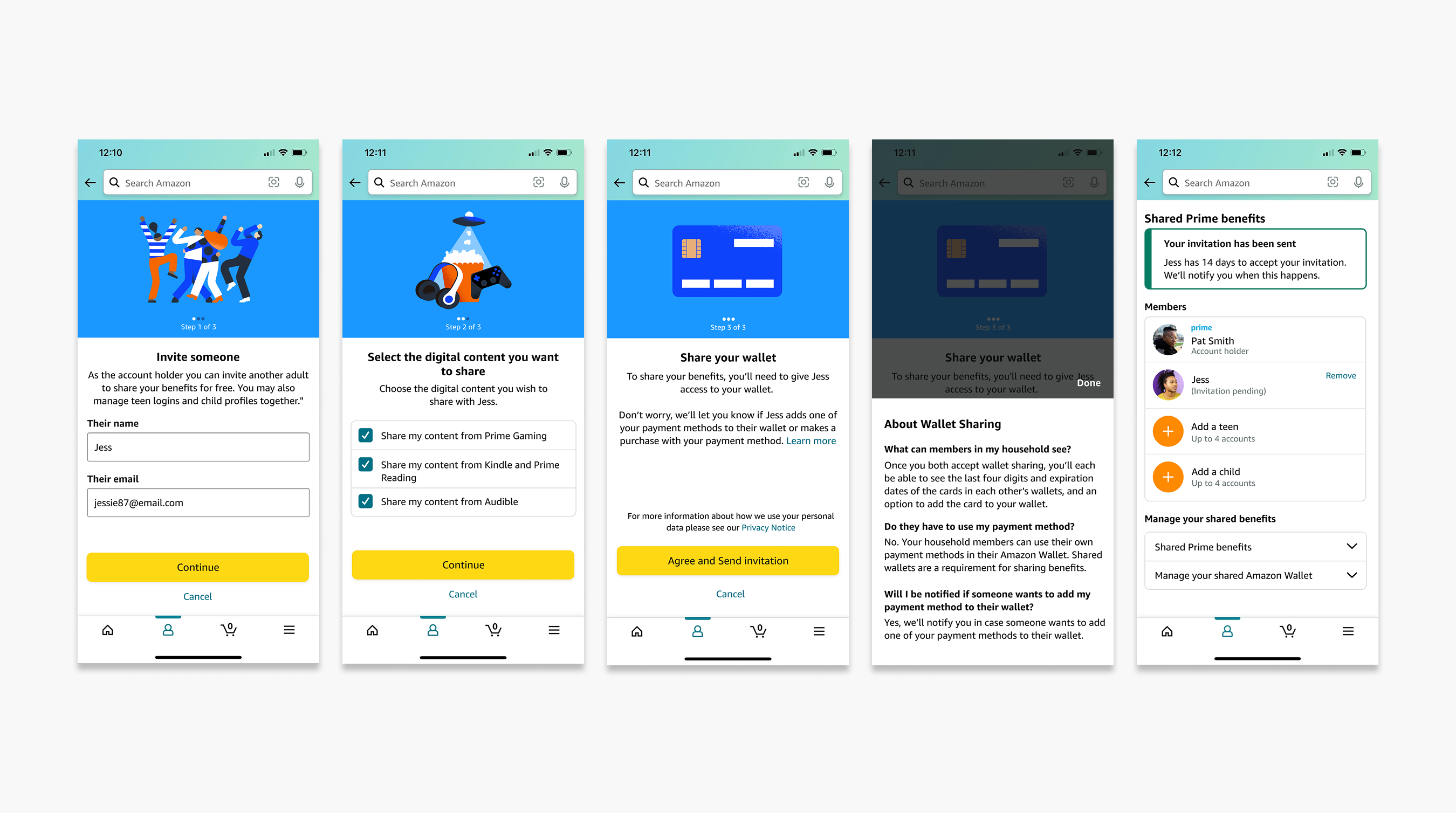
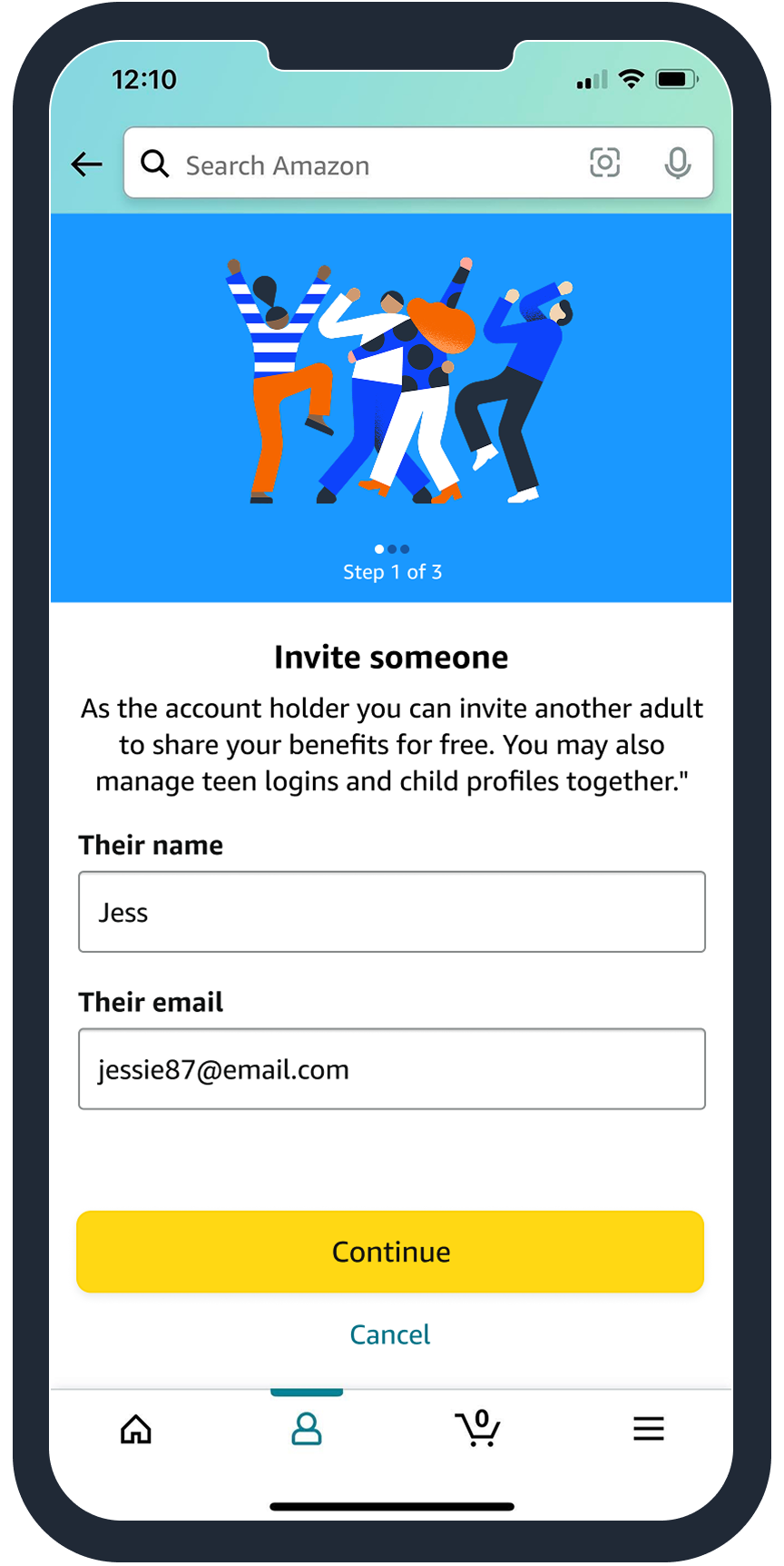
For the inviter flow, I redesigned the first screen to clearly outline the benefit and steps, including mention of wallet sharing to set expectations upfront. I worked closely with a UX writer to simplify the copy, making sure it was digestible while mentioning all the necessary information.
I decided to change the approach to wallet sharing and pitched the idea of sharing a single payment method instead of requiring the full wallet. My cross-functional partners agreed and felt like it would simplify things all around.
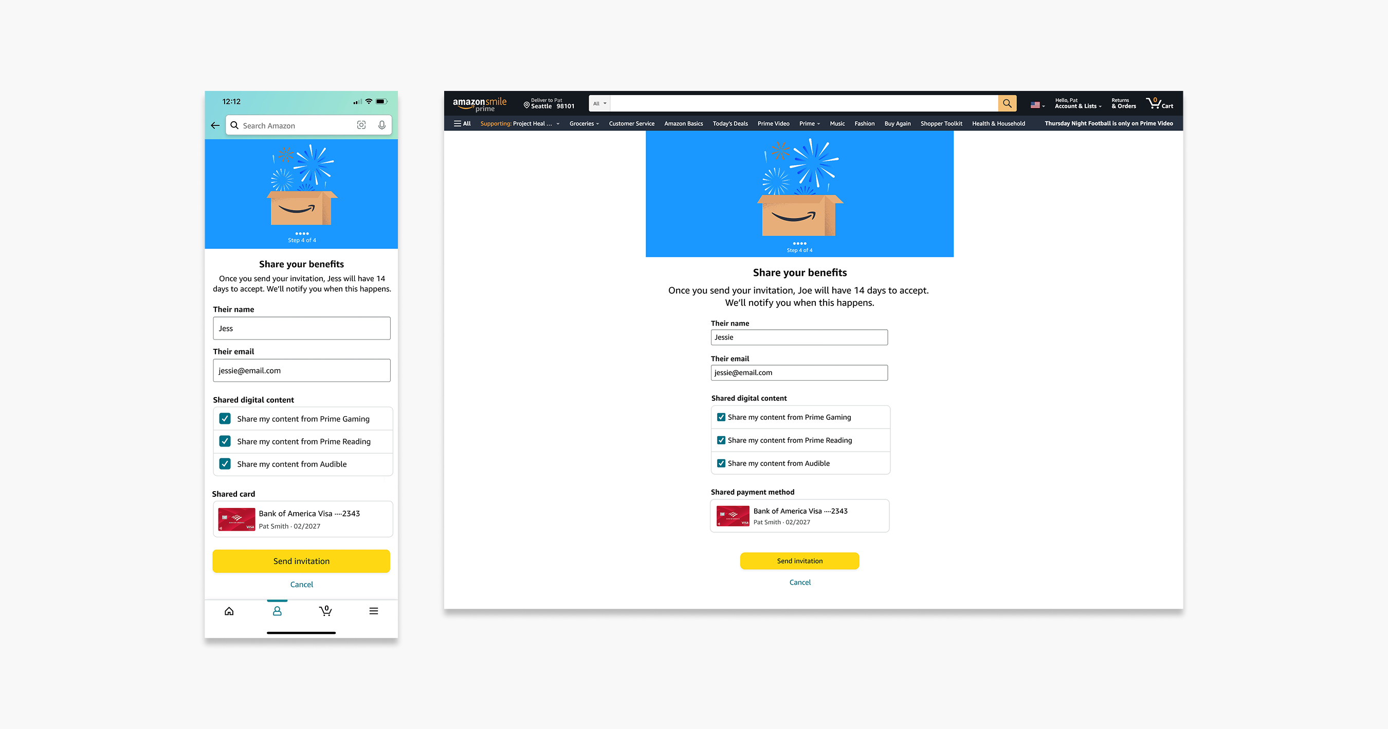
I added a confirmation screen so the customer could review their choices before sending the invite, giving them one last chance to confirm everything and feel confident about their decision.
The customer would be dropped into a redesigned main Household account page they could manage their account without having to dig around.
The invitee flow mirrored the inviter’s approach but I focused on the invitation email to clarify the steps, and set expectations around sharing a payment method, so the experience felt cohesive and transparent.
After these changes, I did another round of testing. The metrics basically flipped!
12 of 14 read/skimmed the homepage
14 of 14 used the words ‘easy’, ‘fast’, and ‘intuitive’ to describe the flow
13 of 14 said the copy was clear and concise
All 14 participants were comfortable sharing a payment method / had no concerns
12 of 14 said they would complete the flow and sign up
The new approach worked and showed promise.
Single payment method sharing
Iterations:
Just as we were preparing to launch, legal intervened. It turned out that sharing the entire wallet was part of certain terms with content studios’s contracts.
The single payment method solution couldn’t be launched. I had to pivot quickly.
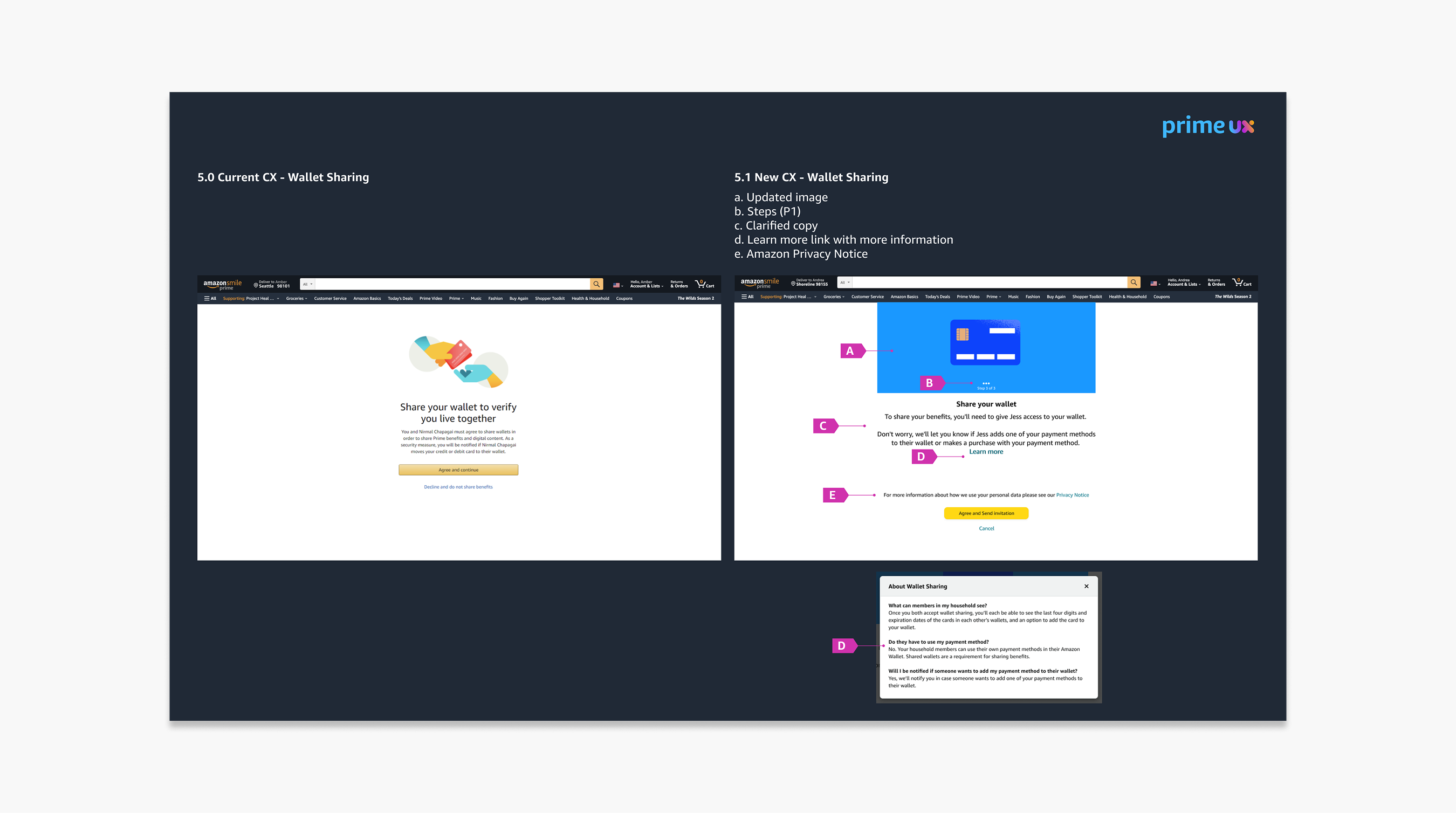
With this new constraint, I went back to our research findings. I focused on the fact that customers had a lot of questions regarding wallet sharing so I added a ‘Learn more’ link that housed the top 3 most asked questions and answers to help reduce risk and increase completion.
I worked closely with a UX writer and legal to rewrite the messaging and make it as clear as possible. I shortened the flow removing the final review, it didn’t make sense anymore and it would save us a step.
A final round of testing showed slightly better metrics than the baseline. As a team, we were sad, but our stakeholders were satisfied.
In the end we agreed with legal to revisit contract terms once they expired in the next 5 years to make our way to that single payment method approach.
However, even with this limitation, the redesign improved clarity, reduced confusion, and provided a strong foundation for future iterations
Despite the pivot, the redesign delivered some slight improvements. The experience felt clearer, more cohesive and intentional.
Members were greeted with clear expectations and a straightforward, step-by-step description that let them know exactly what to expect next. The copy throughout the flow was simple, friendly, and reassuring.
Metrics from launch:
17% increase in Completion rates
15% decrease in User churn
13% decrease in Customer service calls
32% increase in Benefit engagement
This project taught me a lot about uncovering the real challenges behind a seemingly simple problem. I came in with a clear directive: improve adoption and reduce confusion, but research quickly showed that the true barrier wasn’t where anyone expected. Watching customers struggle with the CX made it clear that the problem wasn’t just “a confusing flow,” but a deeper trust and expectation-setting issue. It was a good reminder that the problem you’re given is rarely the whole story.
A thourough design process was my greatest tool for alignment. Journey maps, usability insights, and quotes helped shift conversations from opinions to evidence. This project reinforced how powerful simple, transparent communication can be.
Overall, this project reinforced that thoughtful design, grounded in research and aligned with business and legal realities, can transform an experience and set new internal standards for future initiatives.
To comply with my non-disclosure agreement, I have omitted and blurred confidential information. All of this case study's material is copyrighted and property of Amazon.
Life moves pretty fast, if you don't stop and look around once in a while, you could miss it
Thanks for stopping by
Have some fun