This project is part of the Prime Household initiative, the focus was on teen accounts.
With Amazon Profiles around the corner, I needed to design an off-ramp experience for teen accounts aging out of their Prime Households.
I led the end-to-end UX of a transition experience for teens turning 18.
↓ Check out the nerdy details below ↓
Sr. UX Designer
June 2023
User Research, UX Design, Prototyping, Testing, Storytelling
Sr. Product manager, Sr. Software engineer
The Prime Household initiative had a few areas leadership wanted to improve. Part of the strategy called out teen profiles and the existing experience when a teen ages out of the Teens program and their Prime Household.
Teen members that turn 18 didn’t have a clear way to off-ramp onto a regular Amazon account or their own Prime plan as they age out of the Teens program. At the time they would receive an email when they turn 18, letting them know that they must either remove themselves from their household or have their parent do it, if not they would be automatically removed in 45 days. This created a lot of confusion, frustration, and resentment from both teens and parents.
Role & Challenge:
I led the end-to-end UX design for a new off-ramp experience. I collaborated closely with a Senior PM, UX researcher, Senior engineer and UX writer. I also met with the Senior UX designer from the Profiles team to make sure this experience would seamlessly intergrate into their work around Amazon Profiles.
The challenge was that Teen members that turn 18 didn’t have a clear way to off-ramp onto their new Amazon account or a Prime plan. If they missed the email, they would automatically be removed and converted into a regular Amazon account. The process in place felt cold and rigid.
Business goals:
Business targets were increasing membership conversion rates, overall satisfaction and reducing account cancellations and customer service calls.
Research & Insights:
As part of my design process, I wanted to understand the pain points of both teens and parents.
I partnered with one of the UX researchers on the Prime team and did 2 sets of interviews, one for teens and one for parents who had teen accounts in their Household. Because of legal restrictions, we decided to interview people aged 18-22 that had previously been part of a Prime household and had aged out.
Key Insights:
10 of 10 teens wanted clarity about what would happen to their account
9 of 10 teens wanted to be able to choose what they wanted to do with their account
10 of 10 parents wanted to be informed about this earlier
9 of 10 parents wanted to know what options or offerings they had
8 of 10 teens reached out to customer support regarding their account
9 of 10 parents reached out to customer support regarding their account
It became clear that the current experience was abrupt and confusing. Teens felt disempowered and left out, while parents were frustrated that they had no visibility or options.
Across both groups, nearly everyone asked for clearer guidance and more control over the transition. With these insights, I set out to design a CX that balanced empathy, agency, and clear communication.
I reached out to the designer on the Profiles team to learn more about their findings and their upcoming launches. I wanted to make sure this experience would intergrate seamlessly into their flows.
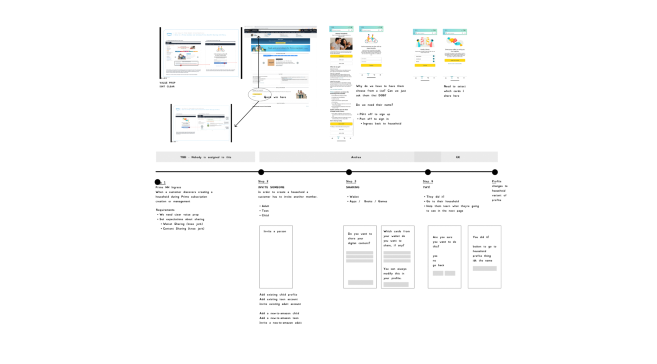
Image intentionally blurred to protect confidential project details.
Design strategy:
I knew that messaging mattered as well as perspective.
My hypothesis was if we frame the experience as a milestone rather than an ending we could significantly improve the sentiment and how this requirement was received.
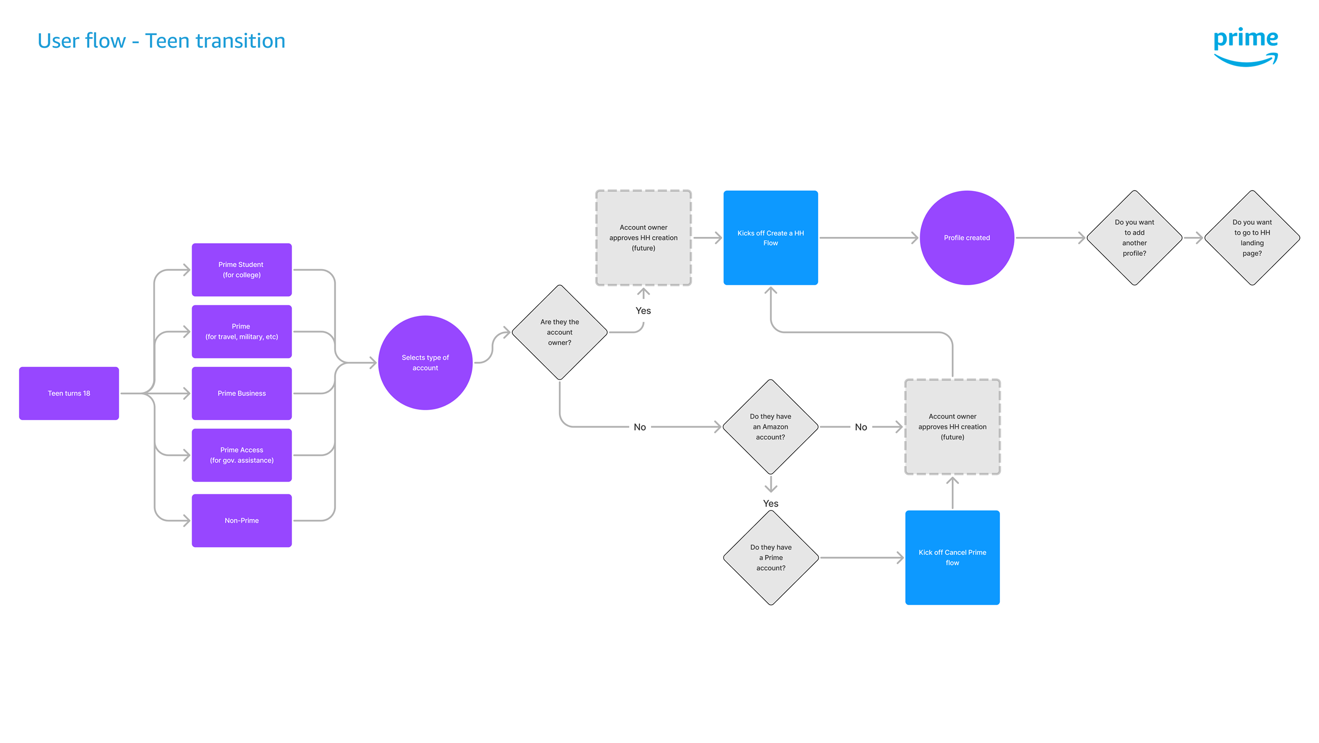
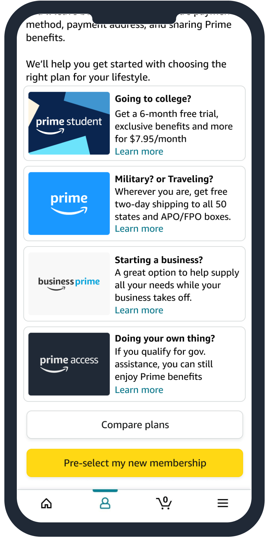
I thought about the different paths someone can take when they turn 18. Someone might go to college, or into the military, start a business, take a sabbatical, get a job, etc. I wondered, how might we leverage Prime’s offerings meet teens where they’re at?
I quickly mapped out my idea with a flow diagram showing different options a customer could take with Prime’s different membership options.
Teens would decide if they wanted to keep their Prime membership on their own or convert their account into a regular Amazon account. Either way, it was their choice now.
I gained alignment with my cross-functional partners and mapped a new approach.
This helped identify touchpoints and potential pain points. The map showed when to proactively communicate and give choices at multiple steps. After aligning with my partners, I moved ahead to mocks.
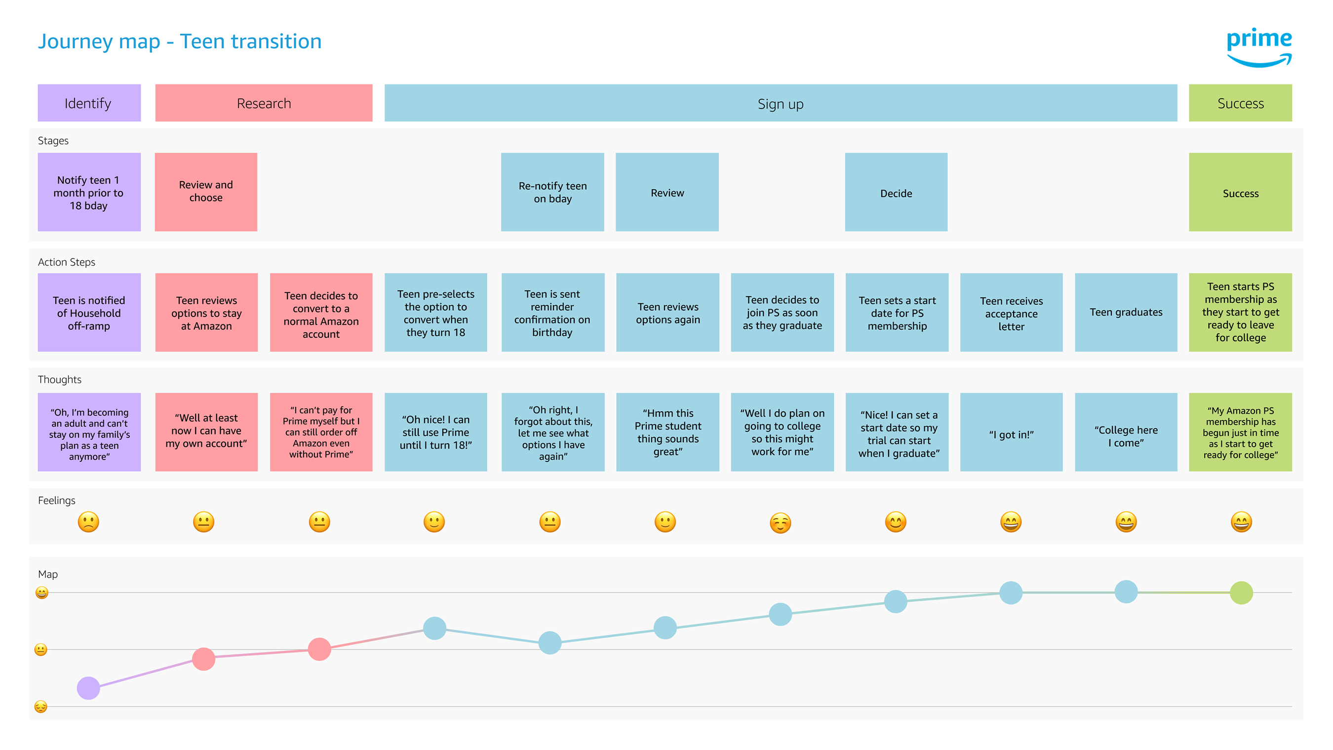
To make the transition feel positive, I made sure to focus on thoughtful communication.
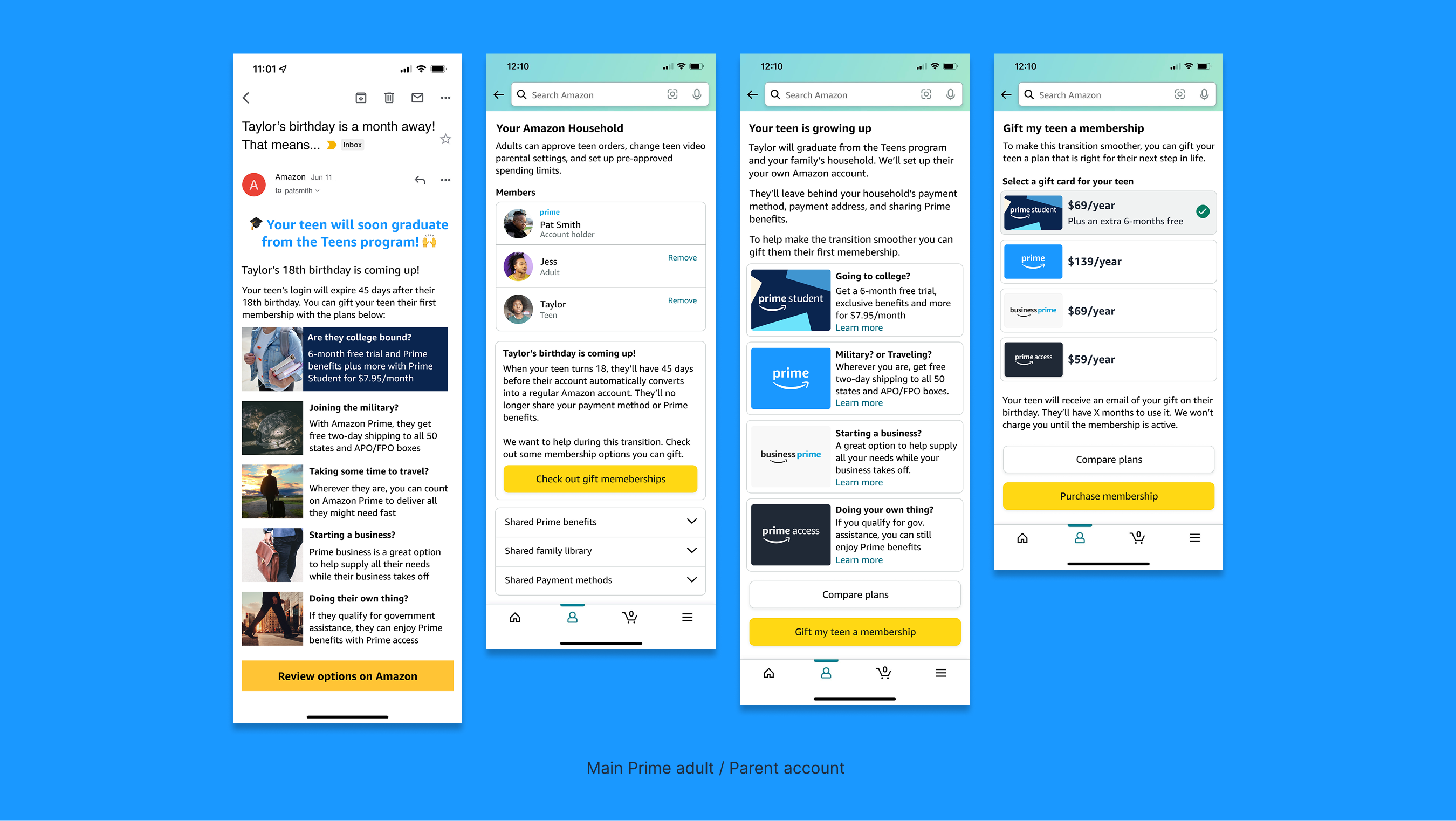
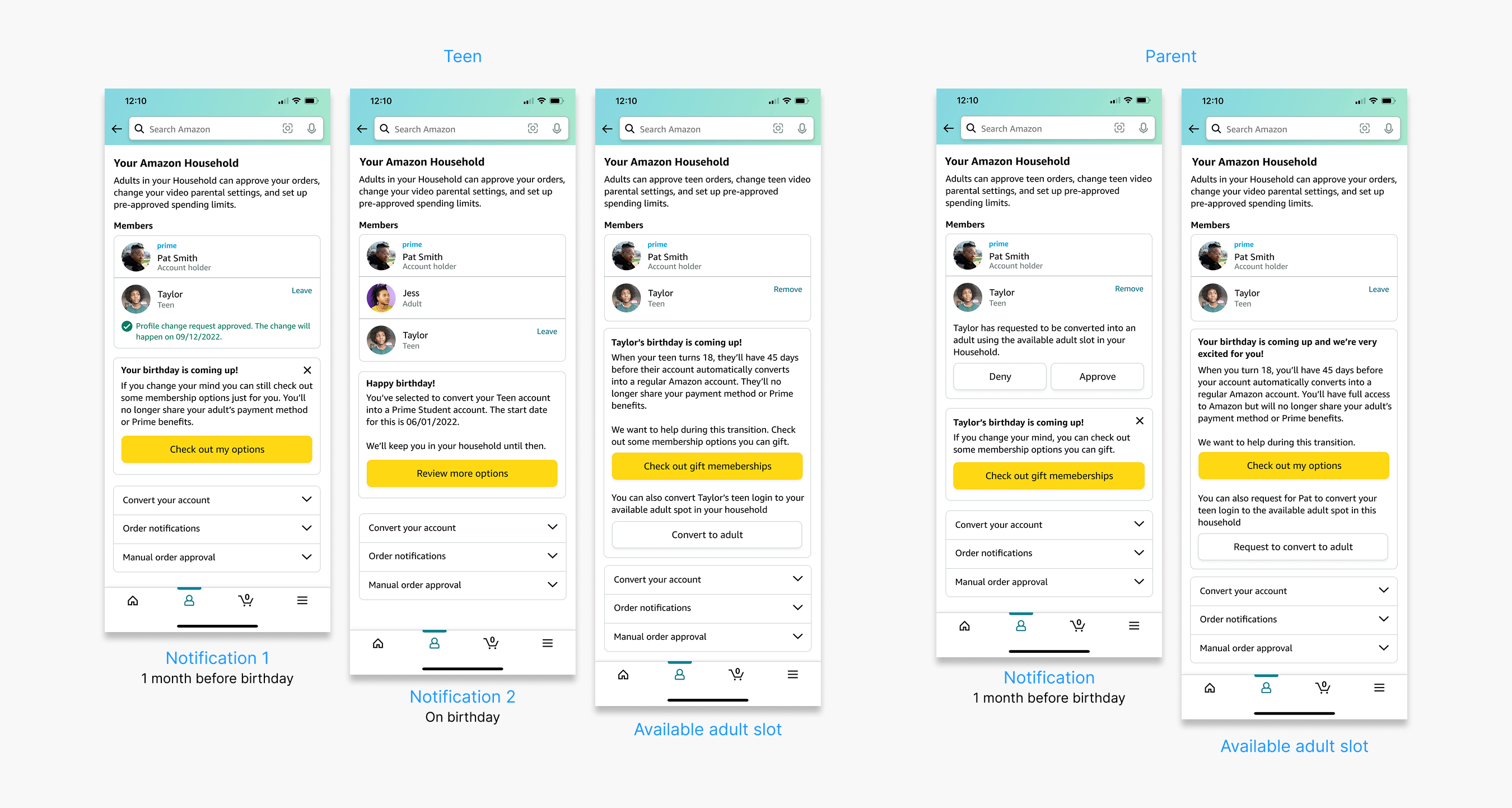
A month before a teen turned 18, both teens and parents received an email that explained what was changing and framed the transition as an exciting milestone.
On the teen’s birthday, they would get one final reminder. I also added another touchpoint with in-app notifications to support these emails so the information was consistent and accessible.
I partnered closely with UX writers to keep the messaging empathetic and easy. I worked closely with engineers to make sure new flows would work within the existing architecture.
The solution focused on giving teens and parents more clarity and choice. Teens could now pre-select what they wanted their account to become from Prime’s 4 different membership options or opt for a regular Amazon account.
Parents would also get a notification email with the option to gift their teen their first year Prime. And if a parent had an open adult slot, teens could also convert into it, without any disruption
Testing & Iterations:
I did a quick round of usability tests to validate our assumptions on the experience. The response was positive:
10 of 10 teens agreed they had agency with their Amazon account
8 of 10 teens agreed the messaging and copy was clear, and easy to read
10 of 10 parents said they found gifting a membership helpful
9 of 10 parents said the messaging and touchpoints were enough to feel regarded
8 of 10 parents said they did not need to contact customer service
“I love the different options. I didn’t plan on going to college so its cool to see other options I can take that might fit my path.”
As I went through final reviewes with my product partner, leadership and legal I made minor adjustments to the copy and visuals to adehere to tone and brand, but the core flow remained intact.
The experience came together in a centralized Household page where teens and parents could manage transitions and explore their options in one place. We paired that with clear emails and in-app messages that explained what was happening, when it would happen, and what steps to take next.
In the end, giving teens more control and giving parents more clarity made for an intuitive and supportive.
Metrics from launched experiment (3 months):
Membership conversion rates increased by 9%
Overall satisfaction improved by 28%
Teen account cancellations dropped by 17%
Adult account cancellations dropped by 23%
Customer service calls related to teen profiles decreased by 21%
This project reminded me of how empathy mixed with agency can shape an experience. Teens felt empowered when they could make choices about their account, and parents responded positively when given clear, proactive communication. And framing the transition as a milestone rather than a disruption helped improve sentiments and reduce frustration.
Collaboration was another key takeaway. Working closely with UX writers, engineers, cross-functional partners, and the Profiles team ensured that the experience was both feasible and consistent across the Household ecosystem.
Finally, this project highlighted how designing with clarity, and empathy can drive meaningful business impact. These principles created a framework for how other teams approached different account lifecycle experiences across Prime.
To comply with my non-disclosure agreement, I have omitted and blurred confidential information. All of this case study's material is copyrighted and property of Amazon.
Life moves pretty fast, if you don't stop and look around once in a while, you could miss it
Thanks for stopping by
Have some fun